Showing posts with label designers. Show all posts
Friday, April 4, 2014

Accents of color

The spring/summer 2014 issue of New Old House magazine features a new house by architect Rafe Churchill  that is traditional in its detailing, spartan even, but modern in its outlook. Most striking to me was the use of color throughout the house.
Today the norm is white or cream painted trim in every room right? Any color in this generally seems strange or odd. Not quite that long ago colored trim was commonplace and it's a device interior design is missing today. Even in my 1930s apartment I discovered all of my trim had originally been a bright turquoise while doing some work!
 I especially loved this screened porch -my favorite 'room' in the house.
 The cheerful apple green paneling in the family room is cozy, charming, and eye catching.
 The dining room features mustard yellow trim with white walls that tie into the kitchen.
Upstairs paint is taken to another level with glossy white painted floors in this bedroom. Interestingly while the trim is also painted a soft green, the door is left the natural wood.
Even this unusual 'country mancave' as I refer to it features dark painted trim, albeit with exposed stud walls. I'm not sure I'm brave enough to risk this much color in such a way in my own home but would you, could you?  Maybe we should all take a clue from the not so distant past and skip the white trim for awhile.
All images by John Gruen
Tuesday, March 4, 2014

Classic style doesn't date

 As you well know I'm a firm believer that classic style doesn't date.  An example of this is a room by talented designers Tom Fox and Joe Nahem from the 1980s when they decorated the dining room of the Castles on the Sound showhouse (featured in the book Interior Visions).
Working with the great bones of the space, mahogany paneling and a stone fireplace surround, they re-envisioned the formal dining room for everyday use TODAY (or at least 1980s today). Beautiful classic furniture, art, and objects create a space that anyone would be happy using in 1980 or 2014. How many times have you redecorated your own living or dining room since 1980 and at what cost? Do we need any more reason to shun the overtly trendy and revel in classic style
Wednesday, January 29, 2014

The historic small houses of Phoenix Arizona

While I often write about large houses, mansions even, long time readers know that I have always had a preference for well designed small houses (it has been over 7 years now so I think that constitutes a long time!). The golden era of this was the 1920s in my opinion when many high-quality, small houses were built in varied styles.
Just north of downtown Phoenix are a host of 'historic' neighborhoods which are small lots with even smaller houses from this era in a plethora of styles.
One of the things I enjoyed most was seeing these lovely small houses as they were meant to be - STILL SMALL! The problem here in Washington, DC is that small houses quickly get 2nd stories, enormous additions, and become mcmansions in their own right spoiling their jewel-box qualities. Size vs quality?
The other aspect of checking out these neighborhoods was enjoying the lovely gardens people have created here in this arid climate. While some are native desert landscapes (which I enjoyed the most I must admit as they felt 'exotic' to my eastern eyes) others are as lush and green as a house in Maine. Just check out this bungalow above which looks straight out of a California suburb.
One of the oddest houses I came upon wasn't actually very small at 6,000 SF and looked like it was dropped out of the English countryside.
Built in 1930 by Carter Gibbes with builder Neil Gates the house appears to be hundreds of years old. Perhaps they used some reclaimed materials from England like the Virginia House or Agecroft Hall  in Richmond.
The shrubbery and grass was also a bit of jolly old England in the desert of Arizona. While hands down my favorite house it does seem a tad inappropriate for the climate and location?
More fitted to the environment was this recently remodeled bungalow.  It's easy to forget how much work it is to have such green grass in Phoenix!
This charming little bungalow also caught my eye although I wish they hadn't planted the tree directly in the middle of the house!
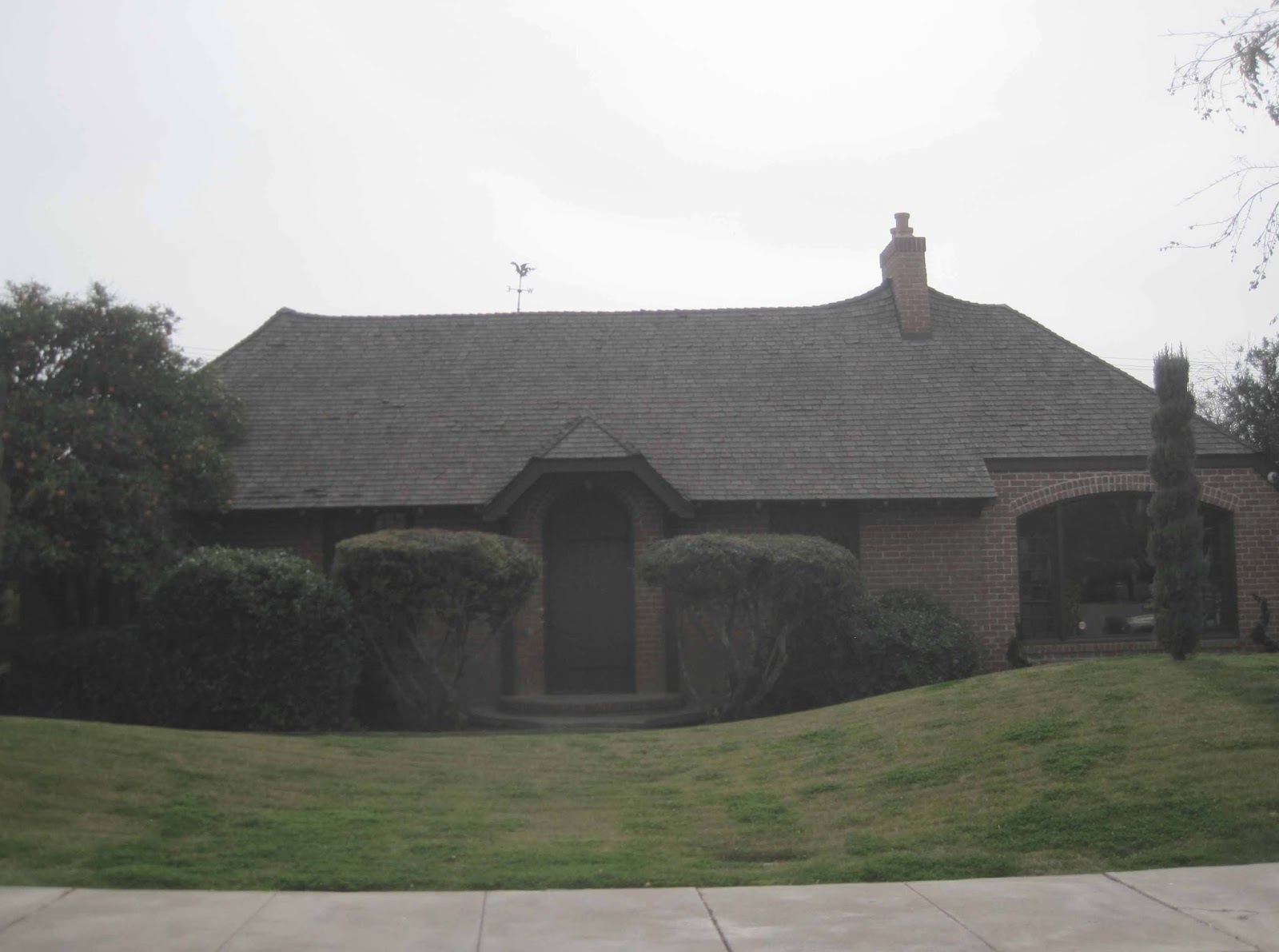
While the photograph is hard to see notice the wonky Cotswold cottage style roofline on this house -can't you see it being thatched? I'm sure it wouldn't last long though in the Phoenix summer heat.
This house also was charming and cozy looking; Loved the front porch.
Nearby was an art deco church with this very Hollywood Regency looking entry canopy.
England to France to California and now Italy -have you ever seen an Italian style ranch complete with Della Robbia plaque? This seems very appropriate to the climate and I love the clay tile roof.
This house was renovated to be modern but retains the compact size. I loved the entry courtyard.
The cactus garden above is really fun and I loved these wispy green trees seen to the left and in all of my favorite gardens -does anyone know what they are?
Of course most houses were either Spanish mission style or a modified Pueblo design like these two.
This 2 story house looks to be plucked out of Beverly Hills, no?
As does this house below which could have been the house of an aging Norma Desmond.
And straight out of Carmel, California were a number of cute storybook cottages!
The one above could use a little curbside enhancement but the form is basically there.
In contrast, this house is clean and tidy and lets the irregular roofline speak.
This large Tudor style house could have been in Connecticut except for the palm trees and yellowed grass.
Last but not least, Marcel DuChamp eat your heart out!  A condo development featured this statue of a woman holding a urinal -doesn't this just scream 'welcome home'? Hope you enjoyed seeing these small houses and maybe even got some inspiration; Bigger isn't always (and infrequently is) better!
Friday, January 17, 2014

Don't miss this housetour!

I don't often read Apartment Therapy as it tends to be a little cookie-cutter 'contemporary' for my tastes but once in awhile they feature some great house tours. This week featured an apartment in Chicago with so much character and style I had to share it with you all!
I hate when people share an entire article or tour (SPOILER!) so I'll just share these 3 teasers with you.  I love the quirky collection of items and the dark hued walls & trim. While each object may not be to your (or my) tastes, the collective quality and ambiance of the space is top notch in my book.
Definitely check out this stylish house tour HERE! Or if you are interested in stuff related with glazing then check out Double glazing companies in Bath.
Monday, December 9, 2013

Belgian ambassador's residence interiors 3: Library & summer room

The last rooms of the Belgian ambassador's residence by the firm of Horace Trumbauer that I will share are the most informal and perhaps the favorites of everyone who visited.  The library features Regency-style paneling of mellowed natural oak inspired by a model from the Chateau de Bercy which was on view at the Met in New York.
During our visit as twilight fell, a roaring fire welcomed one into the cozy room. The shelves feature a number of interesting books on Belgium and also photography, a passion of the current ambassador. The wood frames surrounding the shelves open which led me to wonder if they once held metal screens, glass, or perhaps fabric panels.
All of this mellow wood is beautiful but leaves one wishing there was a bit of contrast, no? brown brown brown. The game table below featured a beautiful Jade chess set.
 The fire did eventually burn down unfortunately but the marble mantel piece was no less beautiful.
Just off the library is the Summer room or loggia which features a stunning treillage treatment on the walls. This felt like one of the most used rooms we visited with comfortable sofas and a dining table. I loved the chandelier here which fit the garden theme.
The medallions feature paintings of birds such as cockatoos, flamingos, spoonbills, and macaws; perfect for the current ambassador's love of avian life.
 I can see this being my favorite space in the house, daytime or evening.
A close up of the walls shows the incredible detail in the wood treillage, the faux painting, and the beautiful medallions.
One last feature to share with you to round out the posts on the residence are the panels featured on every French door; I had never seen anything like this.
Much like a car window, perhaps harking back to the family fortune from Dodge, the 2nd pane up on the left hand side of all of the French doors would open while allowing the doors to remain closed and locked. During the recent renovation when the existing doors were converted to double pane windows in interest of energy savings, this feature was retained.
I hope you all enjoyed this 4 part tour of the Belgian ambassador's residence designed by the firm of Horace Trumbauer. Many thanks to the ambassador for sharing this lovely house with all of us and the ICAA for hosting another wonderful event!
Friday, November 15, 2013

Michael Hampton at Baker furniture 'tabletop'

Last night I attended a fun event at the Baker Furniture showroom here in Georgetown where 4 designers worked their magic to get everyone into the holiday spirit by decorating tabletops.
My favorite table design was by my good friend designer Michael Hampton I'm pleased to report! Michael's interesting modern table focused on a new china pattern from Bernardaud in collaboration with Prune Nourry et JR.
The best thing about this china pattern isn't seen at first sight, the backside features the rear of the two hands! Learn more about his interesting tablesetting at his blog.
The fun part of attending such events, other than the chance to catch up with friends, is the chance to checkout the beautiful showroom. I loved this fun new chandelier called Syro.
 Another beautiful table was decorated by local designer Patrick Brian Jones.
Vintage crystal and china mesh seamlessly with new atop sparkling placemats. While I prefer a proper tablecloth it would hide the beautiful Baker furniture and that does rather defeat the point!
Events director and boutique owner Timothy Albrecht used a number of beautiful items from his store, Consider it Done, to decorate his own table. He was also kind enough to lend items to the other designers!
I love the modern brass utensils and gold and white is always classic.
 See anything to inspire your own holiday dinner table?
Many thanks to Baker Furniture for hosting the event and the fun evening!