Showing posts with label designer. Show all posts
Monday, January 27, 2014

Frank Lloyd Wright's First Christian Church

This past week I visited Phoenix, Arizona, and unexpectedly fell in love with the city. The desert landscape, friendly locals, warm winter weather, and dry air all impressed me.  Of course knowing me you know there was also a lot of architectural tourism going on!  Late in his life Frank Lloyd Wright moved to nearby Scottsdale to escape the cold winters in Wisconsin. His legacy is strong in Phoenix and many buildings bear his stamp.
One of these buildings designed by Wright was actually built more than a decade after his death. The First Christian Church was designed for another organization in 1949. 20 years later the church needed a new building and bought the plans from Mrs.Wright at his nearby camp and school, Taliesin West, where the plans were stored.
Finished in 1973 the church appears to be triangular from any angle to reflect the Trinity (Father, Son, and Holy Ghost), while in fact is not 3-sided at all. Stone, concrete, glass, and copper fit in well to the desert landscape.
This interesting concrete jungle near the entry provides a beautiful shaded outdoor spot to congregate away from the strong desert sun.
While I remain a classicist my rules soften in different climates. Don't you agree this is a more suitable style in the circa 1973 suburban desert than a Gothic cathedral?
Join me in the following weeks as I feature some of my discoveries in beautiful Phoenix, Arizona!
Monday, December 16, 2013

Holiday Weekends


This past weekend was busy as most weekends tend to be during the holiday season. I've been unable to decorate for the holiday unfortunately but I was able to do a little something to bring some of the Christmas spirit into my own apartment.
At an estate sale I visited this past weekend one of the many scores was a large box full of vintage glass ornaments from the 1930s and earlier (for $2 no less)! I placed these in clear glass vases throughout my apartment for some color and Christmas cheer!
 Another find was this vintage brass lamp with an interesting paper shade. An antique print of an Italian square was mounted to the shade after the windows in the scene had been cut out and infilled with Mylar paper. When the lamp is lit the windows 'glow'! I love the neoclassical brass shaft which I polished along with the marble base as well as the red stone finial. You see it here in my dining room.
I also visited my favorite shop, Artisan. They have tons of new merchandise you have to check out (online as well as in person) and as the owner was telling me, they make perfect gifts. I love the modern take on a classical empire chandelier seen above. The elegant antique French crystal chandeliers in the background are a perennial favorite as well!
Perfect for the arts and crafts house or bungalow is this unique iron and painted glass fixture. Why buy cheap new fixtures when you can pick details that will shine and make your house a unique home!  What are you doing to your house for the holidays?
Tuesday, November 26, 2013

Belgian ambassador's residence interiors 1

As I mentioned in my previous post, I recently toured the Belgium ambassador's residence with the ICAA. Designed by Horace Trumbauer's firm (or more specifically by his chief architect Julian Abele) for Anna Dodge Dillman, the house was meant as a wedding gift for her daughter Delphine to her second husband, Raymond T. Baker. Sadly they only lived in the house for four short years.
After Baker's death, Delphine rented the house to a roster of who's who before finally she herself passed away at only 43.  Her mother shortly thereafter sold it to the embassy of Belgium who have been in trust of the house since 1945.
These gorgeous interiors you see were designed by the Paris interiors firm of Alavoine et Cie. The entry hall, seen above, may look like it has stone walls but they are in fact molded plaster. The floors however are marble.
Immediately to the left of the foyer is the stairhall. This room sets the tone for the ground floor with panel moulding in pastel colors of the time and amazing detail work such as the iron railing.
 I love how the paneling is justified under the stair to different heights. The panels are an excellent organizational system as they hide any number of storage doors, vents, and other utilitarian devices.
 A lovely thing to see before going upstairs, no?
The parquet flooring, chandeliers, and carved paneling was imported from France by Alavoine et Cie. The first ambassador, Baron Silvercruys, hired the firm yet again to complete the space to their original design after many items and furnishings had been removed during the sale and multiple rentals.The Belgium ambassador frequently teases the French ambassador for having a more French house than him!
 Again I have to point out the beautiful bronze hardware - architectural jewelry!
This tiny paneled vestibule separates the stairhall from the men's powder room. Yes there are two, one for men and one for women; a common design element in such formal houses at the time period.
This tiny vestibule may be my favorite space of the house, so precisely decorated like a small jewel box.
 On the opposite side of the entry foyer is the women's cloak room, seen below.
I immediately think of the iconic Cecil Beaton photograph of models in Charles James gowns when I see this room as I imagine this was the setting for many similarly elegant scenes.
The slightly open door to the right leads to the powder room while the panel to the left is actually a jib door and hides a coat closet, full of coats and wellies (yes I looked!).
This built-in dressing table survives and is surely the most elegant piece of furniture in the entire house.
All of the bathrooms feature these custom designed marble sinks with glass legs - they epitomize 1931 bathrooms for me.
I'll leave you with a last photograph of the ladies cloak room (notice the multi-colored umbrellas in the corner and my reflection in the mirror). Look for post 2  soon which will feature the Dining Room and Salon, said by many to be the most beautiful room in Washington!
Monday, October 28, 2013

Weekend shopping: Artisan Lamp CO

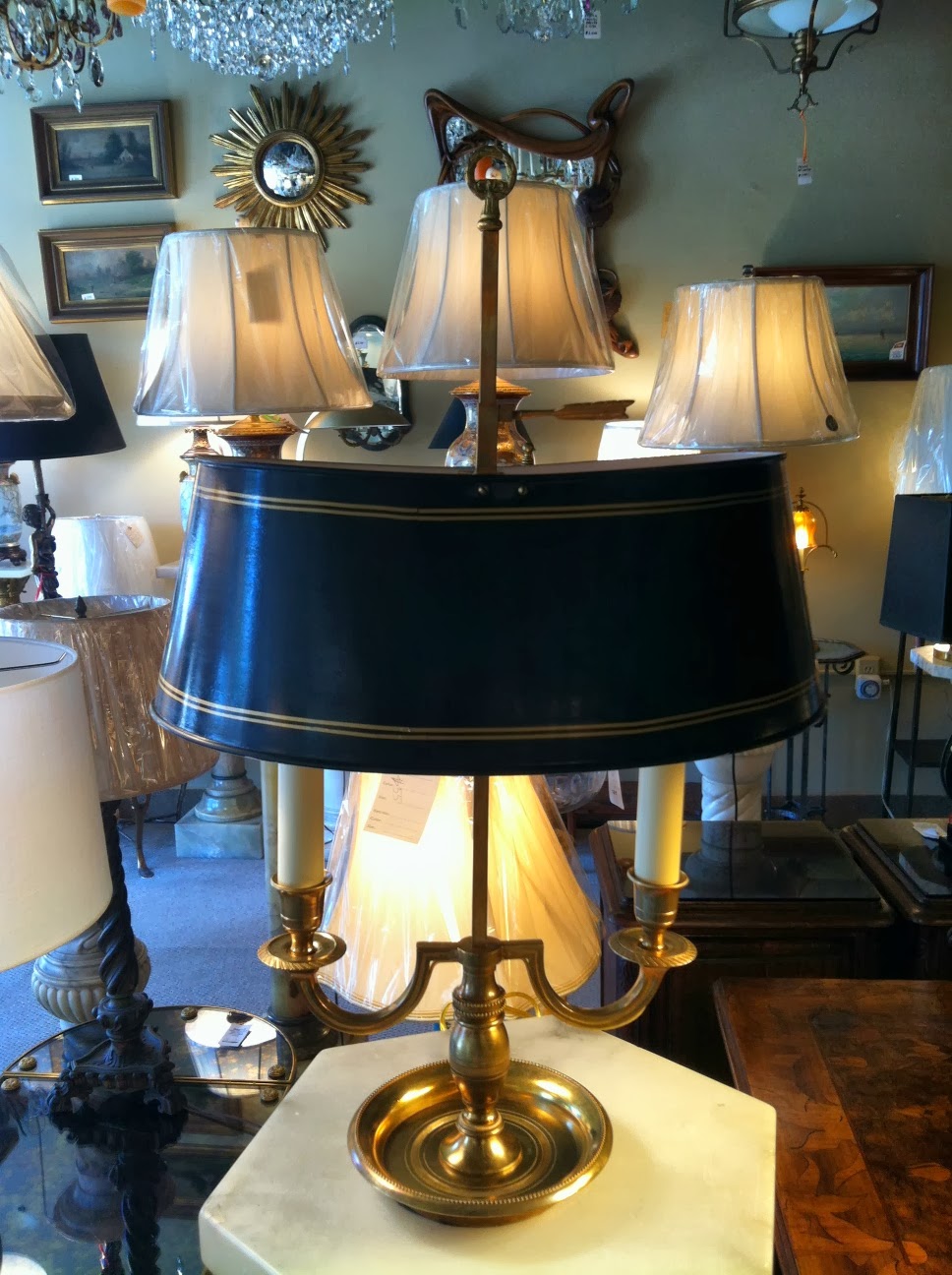
You may have heard me speak of Artisan Lamp Company before, an antique lighting store in the Cleveland Park neighborhood of DC. They recently got in a large container of fixtures from France where they do much of their sourcing and I wanted to share with you some of my new favorites! This old bouillette lamp is a great classic.
One of my favorite things about Artisan is they change their window display every few days - especially as I live a few blocks up the street and pass daily! They have something for everyone from the most classic to funky mid century pieces.
The owner is particular to art deco style and great examples are to be found throughout the shop like this pair of lamps. Can't see see these on 1930s nightclub tables in a Fred Astaire movie?
This cute little arts & crafts bronze lamp would look great on a bookshelf.
I blogged about this interesting peacock lamp before and it's still available!
This aesthetic movement lamp on the right is a stunner. The lit lamp on the left had daisies handpainted on the shade -ideal for a girl's bedroom.
I've been in love with this marble specimen lamp for awhile now (yes, I visit the shop on a near weekly basis!) and can't believe it hasn't yet sold. Now if I could only find the right spot for it in my apartment....
Speaking of marble, this stately lamp is of a red marble with gilt capital and base.
I was obsessed with this fascinating French bronze lamp above but again -no room at the inn.
This very tall chased silver plated candlestick had been turned into a lamp and the detail is just stunning.
This cute little French cherub is a great addition to any traditional interior.
I love this neoclassical orb chandelier; I couldn't tell if the base is metal or stone. Artisan also carries a wide variety of antique decorative arts such as this bronze sculpture and a variety of paintings and glassware.
Don't forget to support your local businesses, especially unique ones such as Artisan Lamp-a real neighborhood treasure. They also sell online through their website and 1stdibs profile.
No payment or sponsorship was received for this post -just sharing an inspirational resource!
Friday, October 4, 2013

Recent work: Dramatic before and after

Reading and writing blog posts everyday I can sometimes forget to mention I'm more than a blogger: I also work in the design industry!  I thought I would share the design process with you on a recent project, a renovated master suite (above is a finished teaser of the bath).
Lets get the ugly stuff out of the way first. My friend had a vintage 1920s house in the lovely Cleveland Park neighborhood of DC (you may remember a built-in I completed for him in the family room HERE). Old houses are great, I think we can all agree there, but old bathrooms are NOT so great - just look at it above!
Above the partial floorplan shows the original layout of the area I worked on which had great potential but didn't work for the client. A small, worn hall bath serviced the master bedroom as well as a small bedroom which my friend used as a dressing room as closet space was inadequate. The front half of the plan not shown on the left had the formerly renovated master suite which had been turned into another hall bathroom, separate laundry room, and a large bedroom facing the street.
Previously one came up the staircase and was confronted with the L shaped hallway seen here (remember, this is the BEFORE!).
Lots of square footage was wasted on the hallway in the tight plan and I had to come up with a way to best utilize the space.
The criteria was for a gracious master bedroom suite complete with en-suite bathroom, separate generous dressing room with loads of storage, and a separate sitting room.
The bones were all there but how best to reconfigure the space while respecting the vintage charm of the house?  Another piece of the puzzle was leaving the exterior of the house untouched as it lies within a historic district where exterior changes are hard to get approved.
I decided to claim the 2nd hall closet and a fair amount of the hallway itself to enlarge the bathroom and provide all of the amenities one expects today in a house of this caliber.  Above you see the 'demo' plan and how I was going to accomplish this.
The plan worked out nicely. Instead of coming up into a vast L shaped hallway, a more compact hall was created with a flush wall great for art at the head of the stairway. The master suite is now entered through a private vestibule which separates the bedroom from a dressing room.  The opening between the dressing room and sunny sitting room was filled in to allow for more storage in the closet and a built-in bookcase in the sitting room.
The bathroom walls were completely removed to both insulate the exterior walls as well as reclaim any space we could find which previously housed ductwork and pipes which could easily be moved out of the way. Our contractor was a great help here!  I decided to panel the walls with wide beadboard which added a vintage charm to the bath of the 1920s time period while also providing a 'warm' environment.
A separate soaking tub and large shower were added as well as an additional sink thanks to the space gained from the hallway.  Now lets see how it turned out!
The hallway is still a generous size and makes sense for the house. Two bedrooms are left on this floor with a 3rd on the floor above. In the photo above you are looking into the new vestibule (painted the same purple as the bedroom) lit by an antique sconce found at my favorite lighting source just down the street in Cleveland Park, Artisan lighting.
Another antique frosted glass ceiling fixture was found at Artisan Lamp for the bedroom, on  a dimmer switch for ambiance of course! You can see through the former closet door into the newly enlarged master bathroom.
Looking the other direction one can see into the sunroom sitting area.  The natural linen curtains lining the wall hide an off-center window as well as provide a focal point for the bed.
The small bedroom became a proper dressing room with ample storage. Double hanging rods fill one entire wall while a large dresser sits opposite.  The antique lamp on the dresser is also from Artisan - you can tell I love to shop there! The closet of this former bedroom was lined with cedar to become storage for sweaters and other off-season items.
The sitting room received a fresh coat of sage green paint as well as a major clean-up. An odd closet was ripped out of the corner as well as an unnecessary non-working but extremely HEAVY radiator.
However the piece de resistance is surely the newly created master bathroom. Wide 6" painted wood paneling was installed rather than drywall or tile as it created a warm, vintage feeling environment.  Foam insulation was blown into all of the walls for sound isolation as well as temperature control.  The window received a cafe height plantation shutter for privacy and a new marble sill perfect for additional storage. Antique neoclassical sconces were found at Artisan which really become the jewelry of the space.
As the brass and black enameled sconces are really focal points I didn't feel the other finishes needed to match and they were all spec'd in a polished nickel finish sourced from the Waterworks studio line ( a wonderful lower priced line which still has the great quality and heft of other Waterworks fixtures). The tile also came from Waterworks. I used a large format dark stone-like porcelain tile for the floor and the coordinating 2x2 tile for the shower floor. The shower walls were lined with a miniature subway tile and a long niche was created for soaps and shampoo. I love the industrial exposed surface-mounted shower fixtures from Waterworks! In-floor radiant heating was installed which can be controlled with the thermostat by the door for warm feet in the cold winter.
The same Italian Crema marble from the Restoration Hardware Gramercy vanity was used for the window sill, shower curb & surround, as well as to line the shower niche. I know you're wondering why I selected an open vanity as opposed to one with storage but I was worried the bathroom would feel tight when it lost that visual space below the sinks. Large medicine cabinets provide tons of storage. The freestanding bathtub from Victoria & Albert was clean lined while still having the appearance of an old Victorian soaker tub (seen best in my drawing earlier in this post).   I'm very pleased with the entire renovation and more importantly so was my friend!  What do you think?
Special thanks to my fantastic photographer friend Bill Bramble who provided the before and after pictures!